Together Lets Tackle Biggest Accessibility Elephant in the Room in 2021.
Gareth Ford Williams
Accessibility and Inclusive Design Strategist Specialising in Atomic Design Systems and Social Model User Data.
I need your help… and the time it will be equivalent to drinking a cup of tea.
This is also something positive and potentially industry changing for 2021 I’d love you all to be part of.
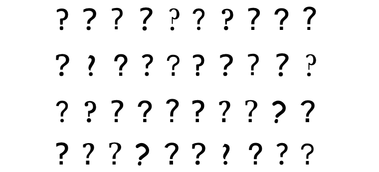
There is a big problem in the UX Design, Accessibility and Usability fields and that is to do with readability.
There is plenty of neuroscience into how we read and this has translated into some best practices… you can find all that in this Medium post, but the one thing we are missing is a study at scale that can provide greater insight and a data resource for further design research.
The problem is that the research done is either very specific, such as the work behind the BBC Reith font family or Amazon’s Ember and Bookerly fonts, or as in the cases of the many font’s that call themselves “Accessible” the research has been done after the fact which renders it meaningless, or researchers make mistake of treating anecdote as data or the whole thing is just a bit well… “1, 2, miss a few, 99, 100!” in that the methodologies are questionable and study size is too small for a subject of this size.
The deeper problem is that there are so many variables. There is the font design, the screen size, the screen type, different types of vision impairment or cognitive trait, tiredness and fatigue, ambient lighting, screen brightness, typographic treatment, problematic letter groups in words like “Ill”, “rn” or “vv” and there’s the way we read… which differs depending on your skill, when you take into consideration that reading as a skill that needs practice and continual exercise.
The breadth and potential impact-fulness of font accessibility has been something of a passion project for me over the last 15 years and I had the pleasure of working with David Bailey and Bruno Maag on the BBC’s typeface BBC Reith. Although we achieved a lot this project made us realise how much more there was to learn and explore and along with Accessibility Research Engineer Michael Mathews, we formed the Readability Group, which has turned this into a personal project, or dare I say ‘mission’ for all four of us.
Over the last year or so we have designed a research framework that will allow us to run many studies to provide data on the subject of font readability in terms of different user group needs.
For the initial study we are going to need a lot of help, probably around 10,000 people to ensure the data we have is statistically significant. That’s one of the problems with other studies is that the data is poor because of its small-scale approach. We intend to make the findings of our studies freely available to the public and we will build off the back of this a huge research dataset.
We are going to focus on 20 fonts to start with and measure the readability of mainstream and ‘accessible’ fonts. This will enable us to measure which accessibility claims stand up and which fonts within this group are preferable to different user groups on different platforms. We can then see trends within the user choices which will enable deeper dive research. We intend to discuss these initial insights at as many meet-ups, podcasts and free conferences that will have us ;) All suggestions and invites are welcome.
We will then broaden the work based on our initial findings especially broadening the research dataset. Hey! We all need hobbies… might as be one that will enable positive change in the world.
So if you want to get involved personally or are part of a network that could add value and insight to the study, then please reply in the comments and follow The Readability Group on Twitter. I will contact you directly when the study is up and running.
If you can think of anyone or would like to help spread the word, please tag them or forward/share this post.
We and everyone else who reads using fonts, especially dyslexics like myself, will be eternally grateful.
Thank you and have a lovely and positive 2021!
#accessibility #designresearch #uxdesign #typography #dyslexia #neurodiversity #a11y #design #usability #product
Global Symbols and Senior Research Fellow University of Southampton
3yHappy to help and hope this will find ways of working around personal preferences as well as need, what we are used to and what might help as well as whether preferences change with time and/or when using a screen or paper! Any more variables?! Good luck with it all.
Director - Research & Design at Transform
3yI'm keen to be involved. Thanks
Product Manager @ Intuit
3yThanks for updating that the study is now available! I just took it and I like how easy it was to understand :) Out of curiosity, will you also be testing the fonts in sentences in addition to individual words? I feel like some fonts may be really readable for individual words, but start to look overwhelming in large chunks of text.
UX designer & trainer
3ySounds like a great initiative, I hope you guys are also going to cover the topic of fluid typography, which hasn't yet received the traction it would deserve
Accessibility and Inclusive Design Strategist Specialising in Atomic Design Systems and Social Model User Data.
3yThe study is now available https://survey.thereadability.group/survey/readability-study/ We will be presenting an interim report at AxeCon https://www.deque.com/axe-con/ Please could you like/stare this tweet as we need a minimum of 1000 participants. https://twitter.com/ReadabilityGrp/status/1359067727885959169?s=20 Thank you